
Let’s say you have an HTML code as this one:
<section>
    <img src="gfx/slider1.jpg" alt=""/>
    <article class="container">
        Lorem ipsum dolor sit amet...
    </article>
</section>
and you skew it using CSS transforms (I’m using LESS):
section {
    position: relative;
    overflow: hidden;
    height: 740px;
    transform: skewY(-2.917deg);

    > img, > article {
        position: absolute;
        left: 0;
        top: 0;
        right: 0;
        bottom: 0;
    }

    > article {
        transform: skewY(2.917deg);
    }
}
It works nicely in all modern browsers, but of course Internet Explorer must give you a headache by presenting jagged, aliased edge:
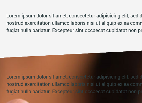
To force it to antialias the edge, just apply this little fix:
section > img {
    top: -1px;
}
and suddenly it looks like this:
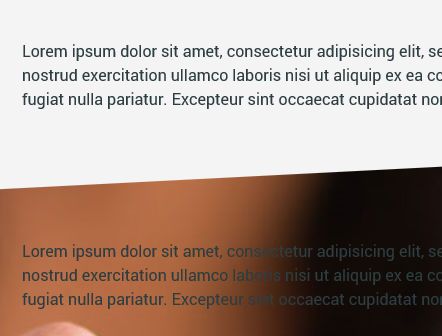
Why? It seems IE antialiases only the transformed element’s edges, but does nothing for its contents. When image is moved beyond parent, skewed element — its antialiasing takes care of stuff.
If it has jagged edges in Chrome, Safari and other Webkit-based browsers, apply another fix:
section {
    -webkit-backface-visibility: hidden;
    backface-visibility: hidden;
}